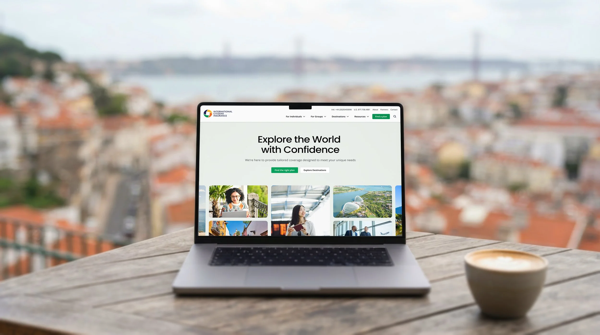
International Citizens Insurance
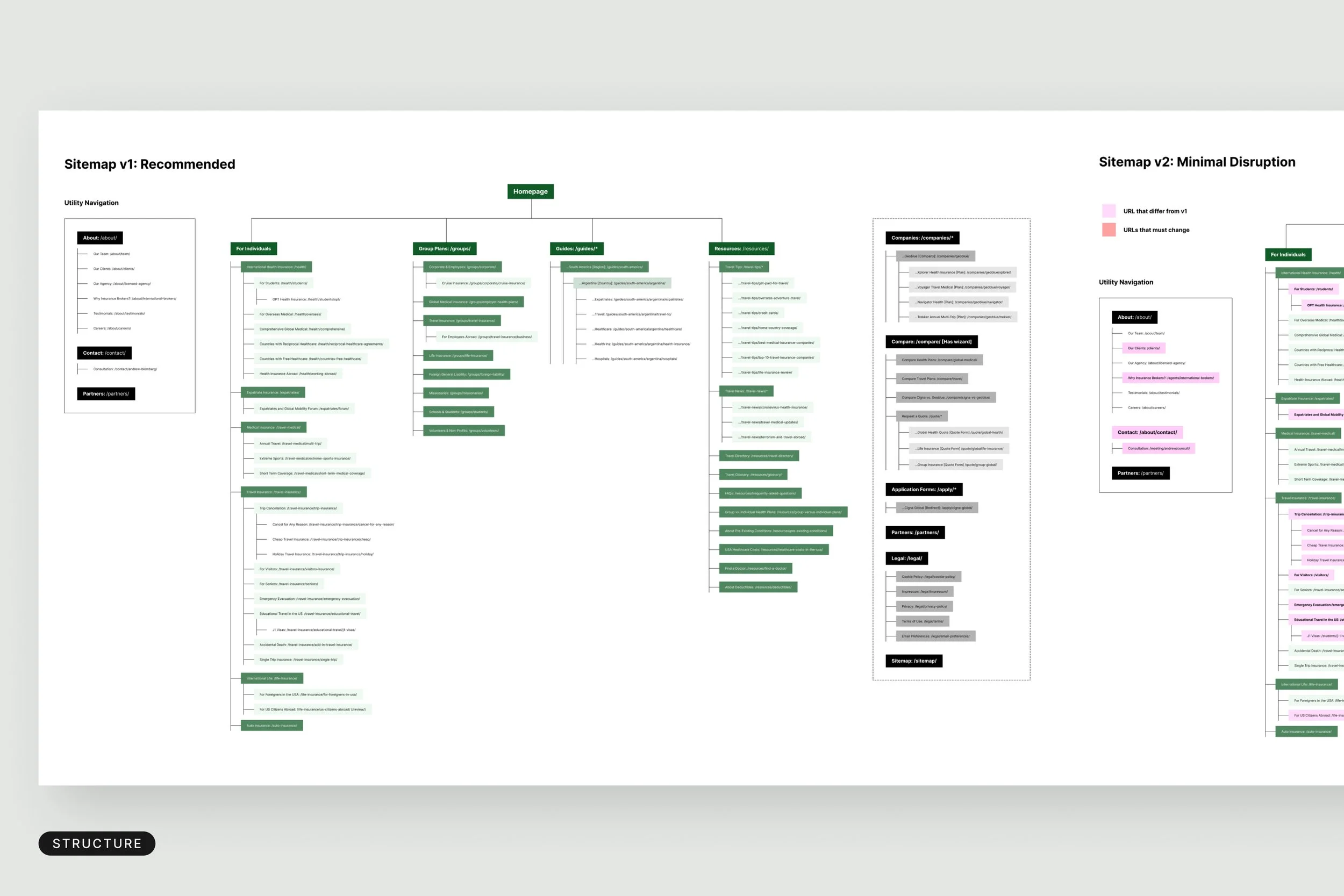
ICI, International Citizens Insurance, helps travelers, expatriates, missionaries, students and organizations find international health coverage through licensed agents who also act as benefit consultants. Its website had grown into a very large, text-heavy library of insurance information. The brief was to keep the depth and lose the density: make the site inviting, and get visitors to the right place quickly.
I was the creative lead, responsible for the design, art direction and user experience, working with the client and with Dan Quinn of dquinn.net, who drove the project as developer and information architect. Together we rebuilt the experience around a design system of reusable templates and modules, so complex information gets a clear layout and the path from first visit to the right plan is short.
SERVICES
Web Design • UX prototyping and wireframing • Brand Design
The Challenge
The original site was accurate and thorough, but hard to use. Pages were long and packed with text, and every page competed with its own calls to action and related links, so it was difficult to focus on the content a visitor came for. Guides, advice, news and articles all looked alike, with little to tell them apart or to filter and sort them. Even the people behind the company were hard to find. The goal was to keep all of that knowledge and make the site feel open and inviting, with the right information easy to reach for two very different audiences: individual travelers and group organizations.
Designing a simpler journey
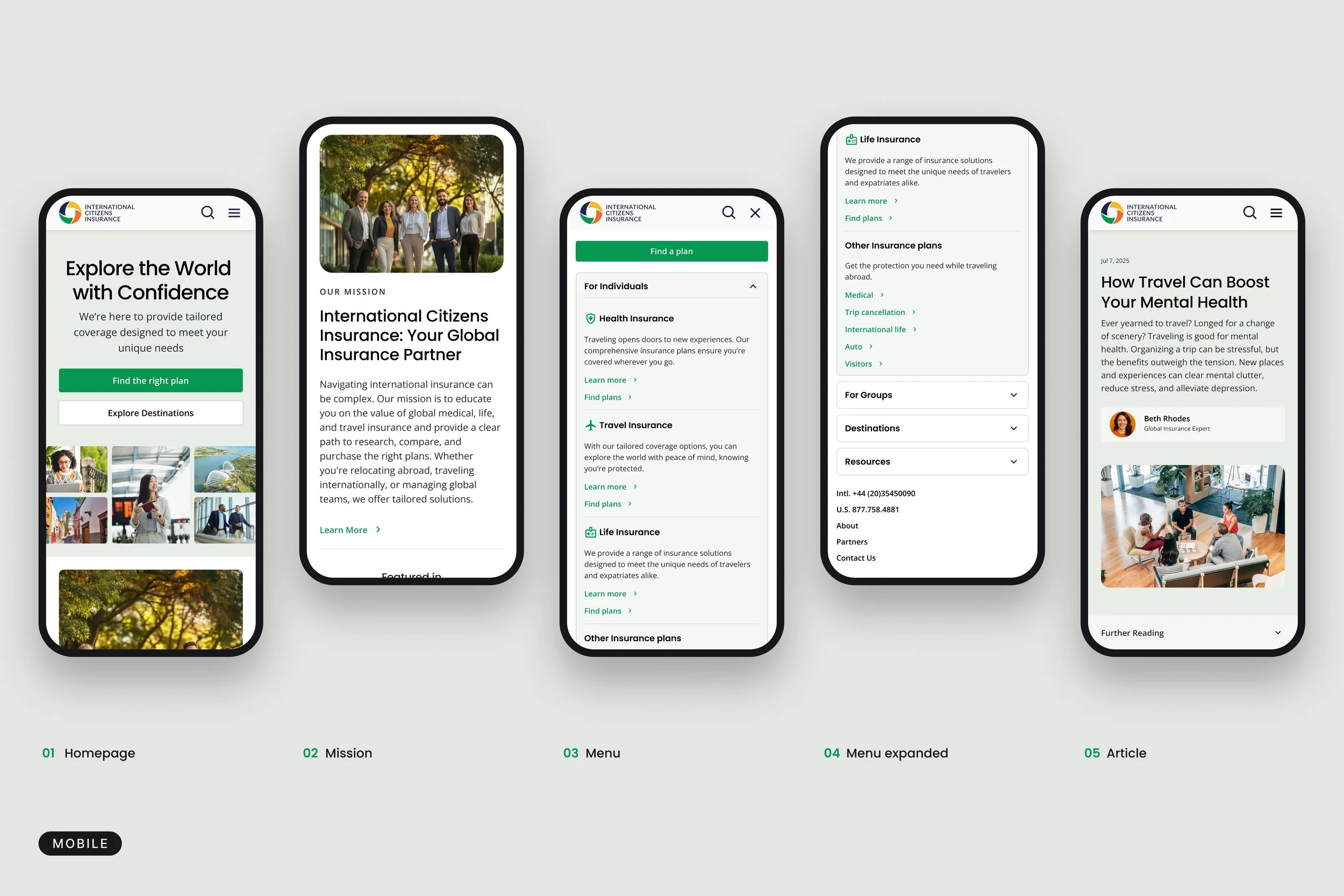
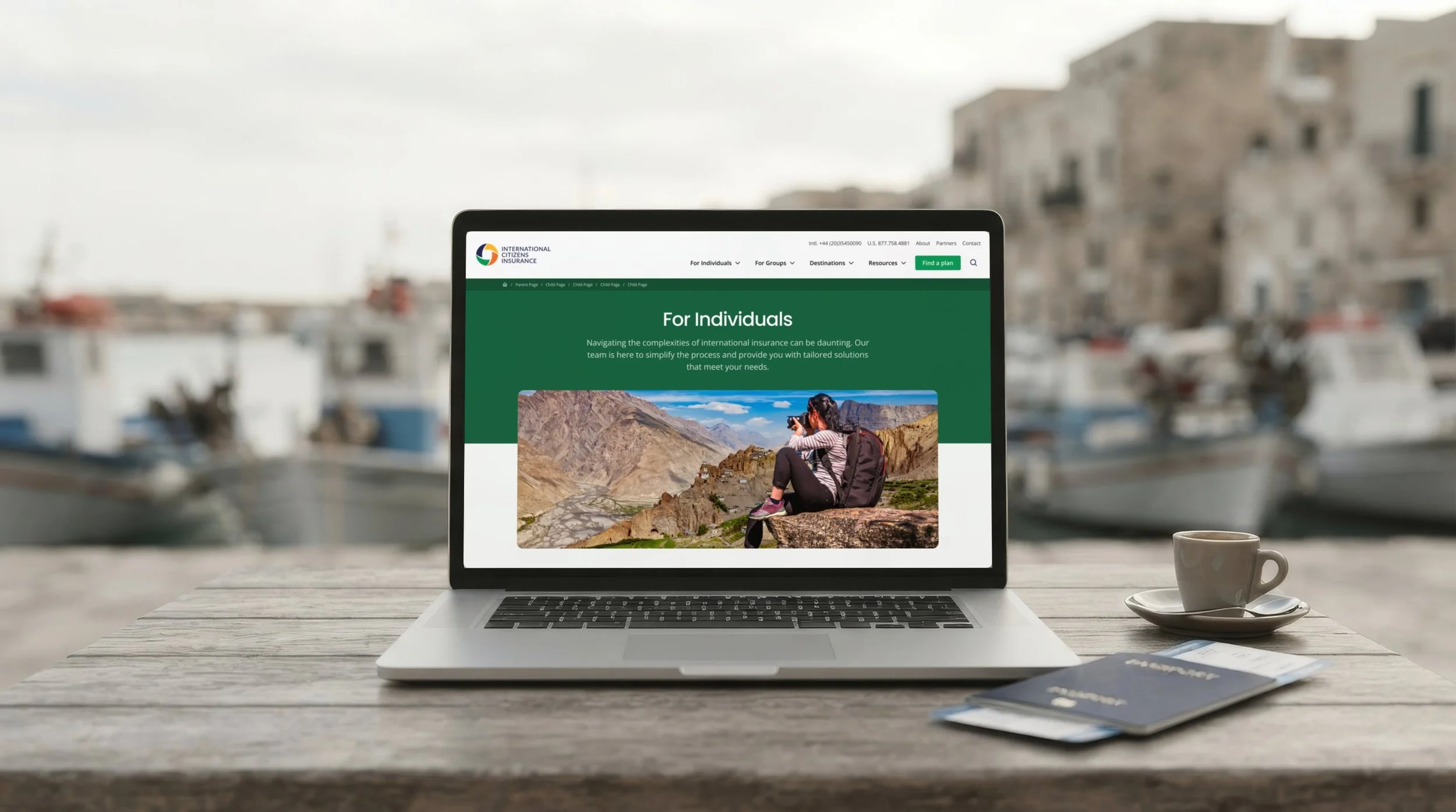
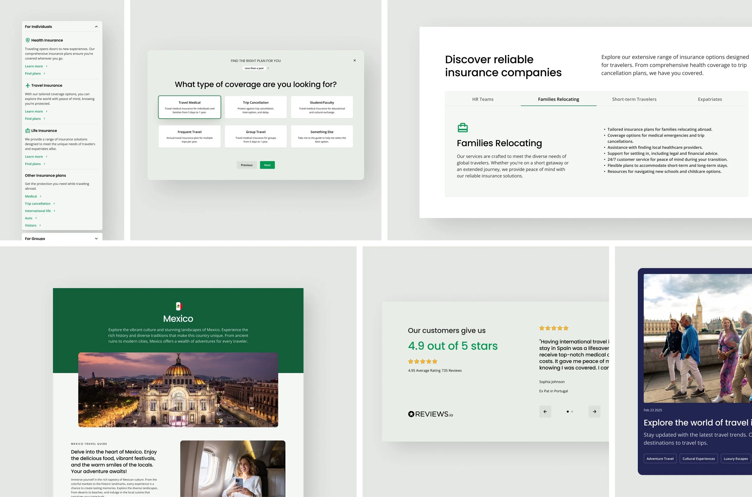
Building on Dan's information architecture, I designed wireframes and a clickable prototype, and worked through them with the client and Dan to decide what each page needed and what could move out of the way. The first move was to split the paths by audience, with For Individuals and For Groups in the main navigation, alongside Destinations, Resources and a single Find a plan action. Mega-menus show the whole structure at a glance, so a visitor can go straight to a country, a plan type or a guide without reading through pages to find it. Comparing plans became one guided step-by-step flow instead of a series of separate pages, which keeps people moving toward an outcome.
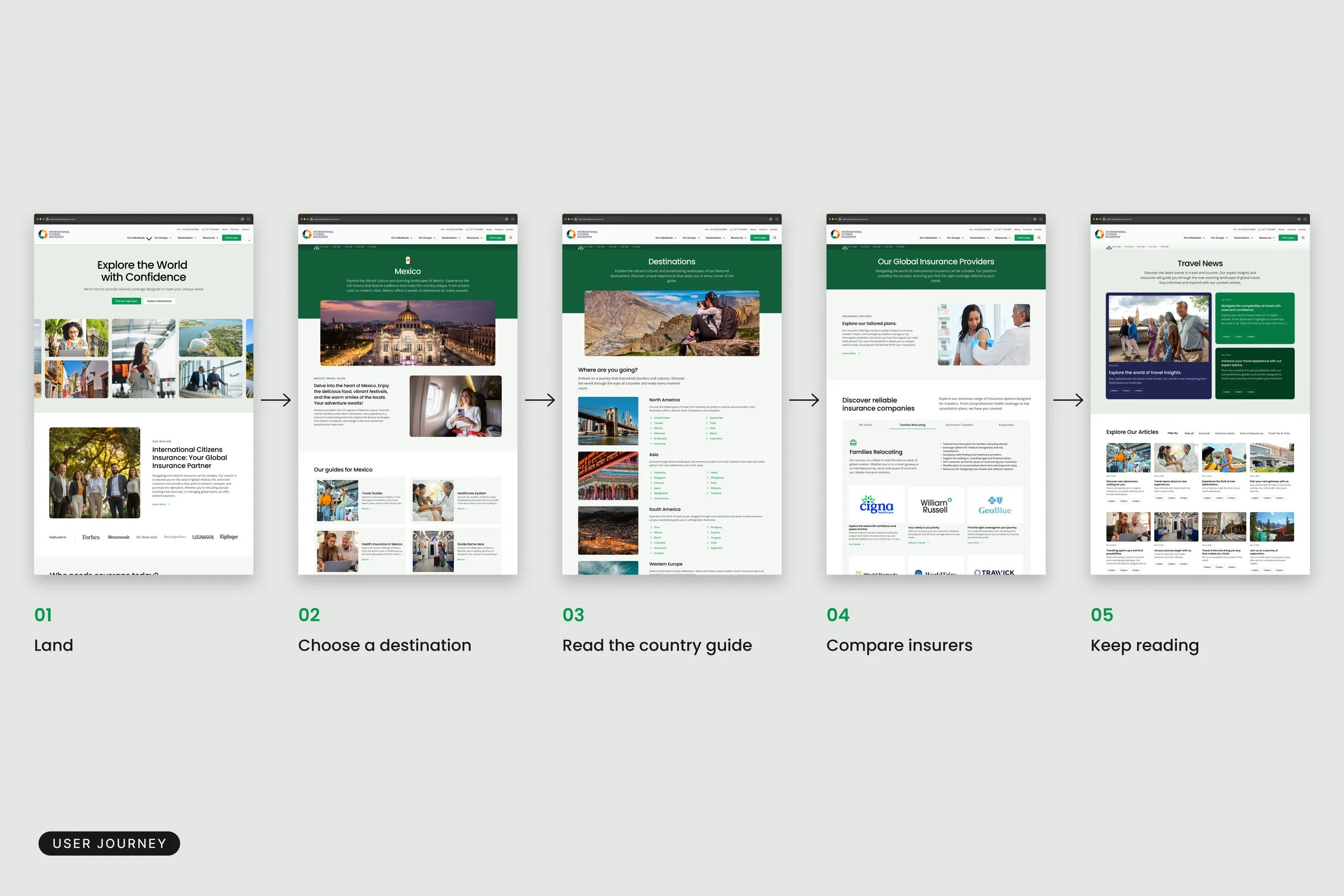
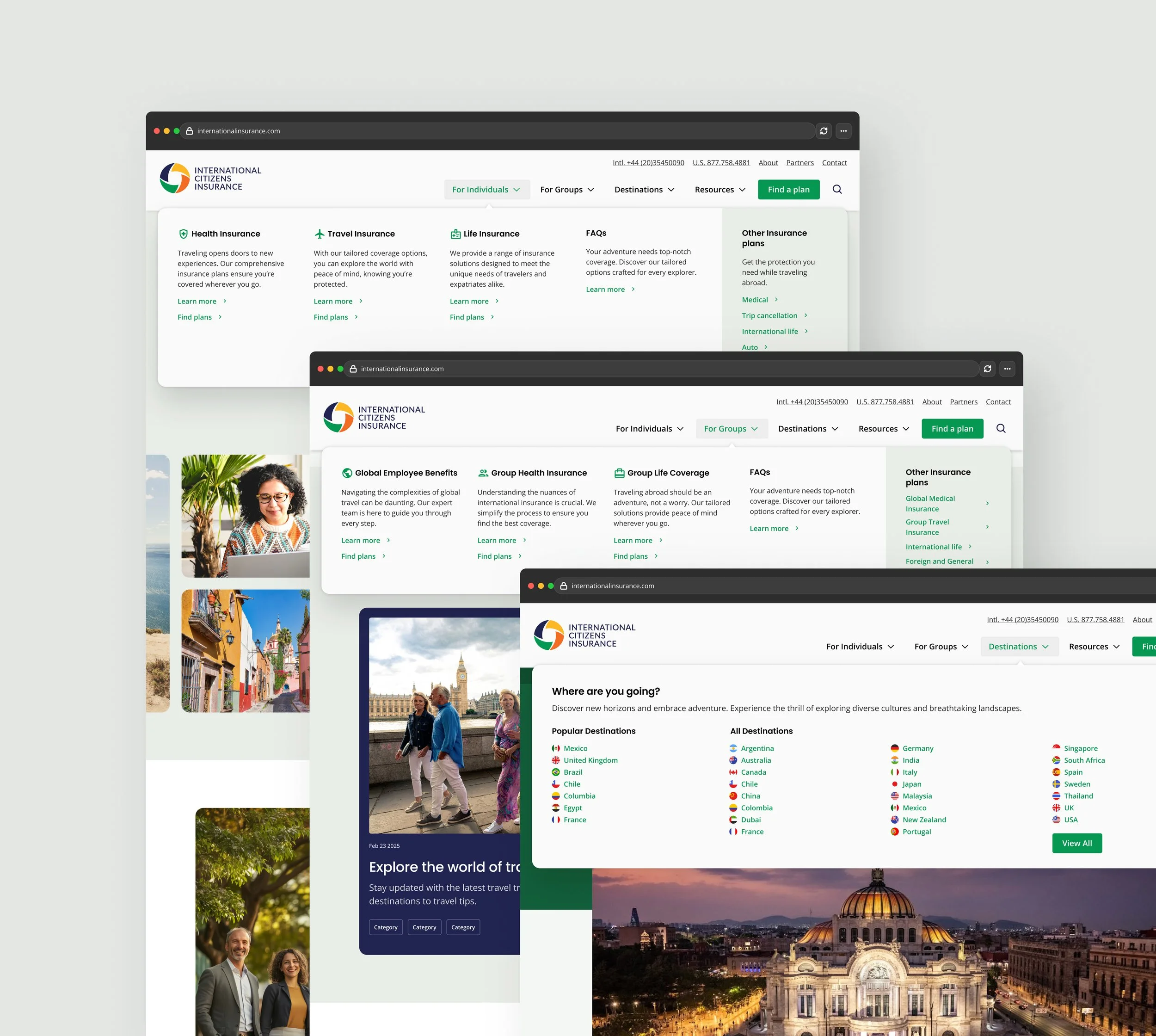
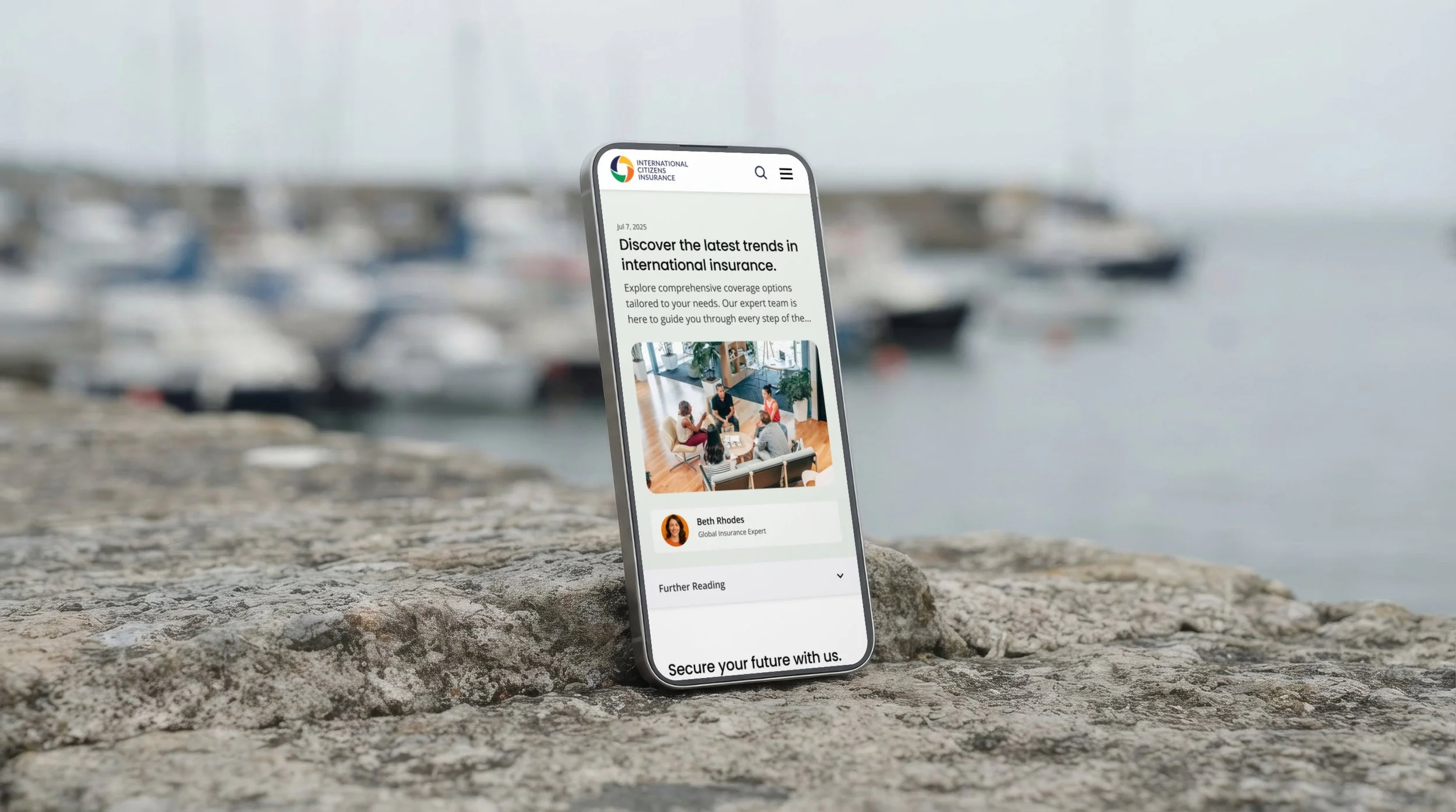
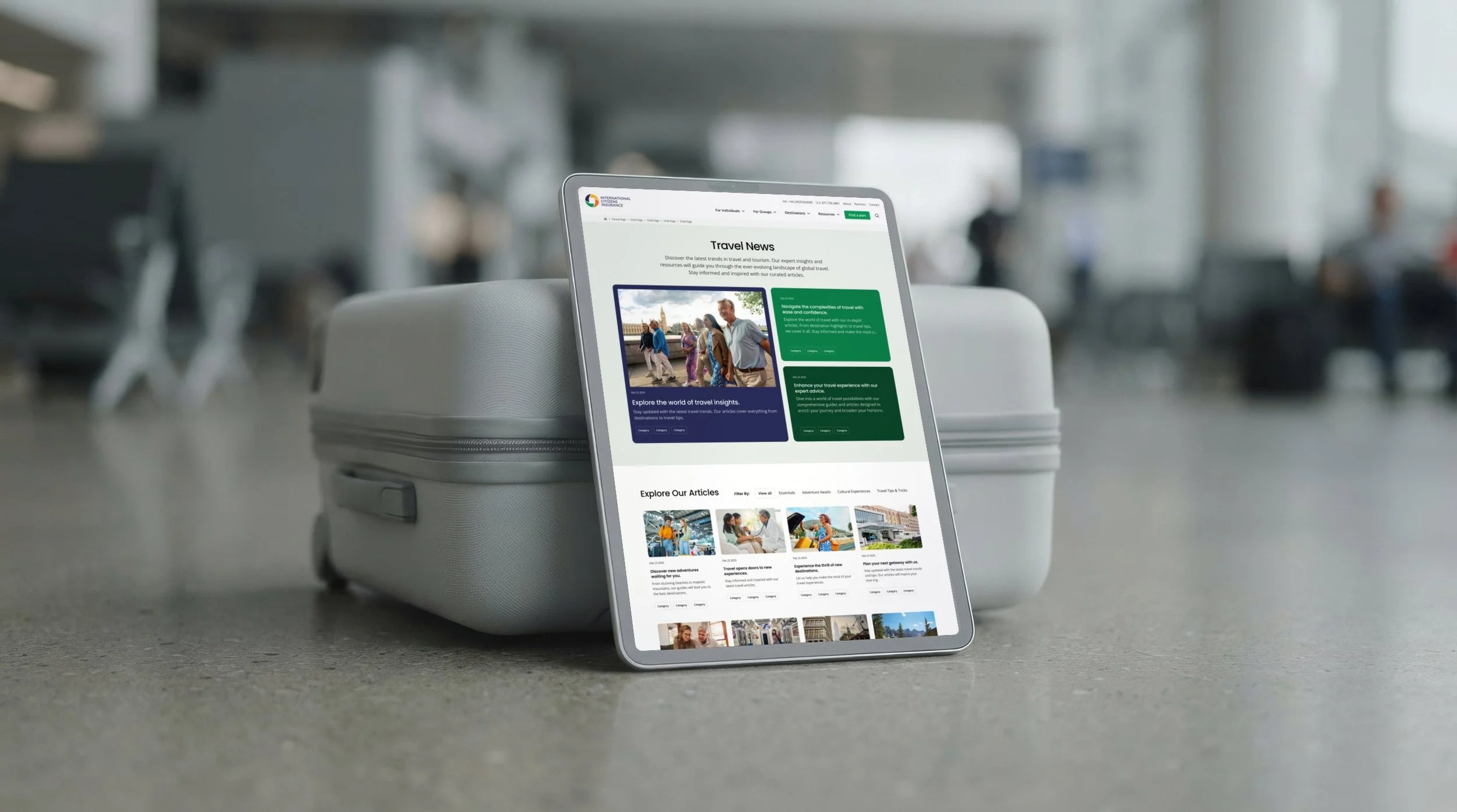
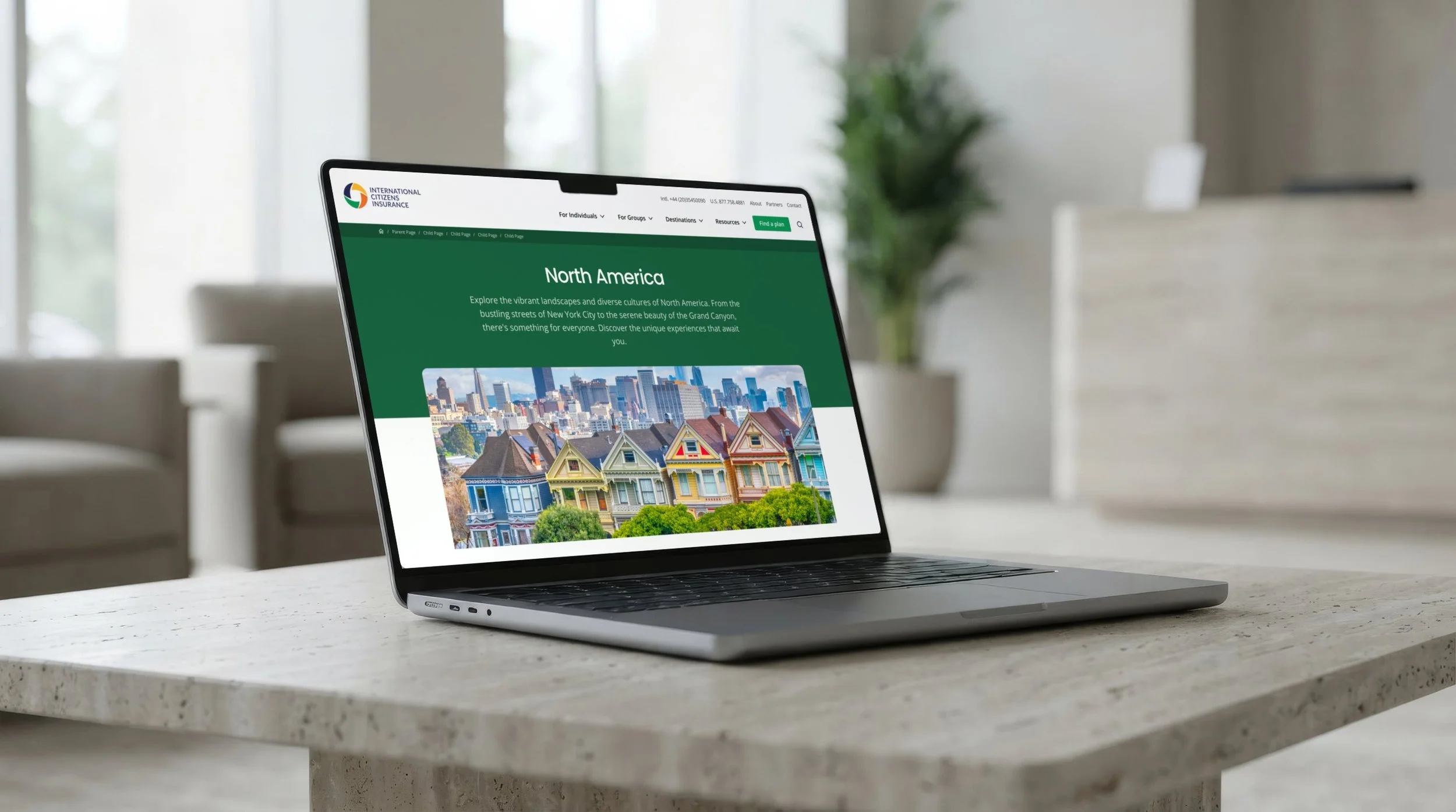
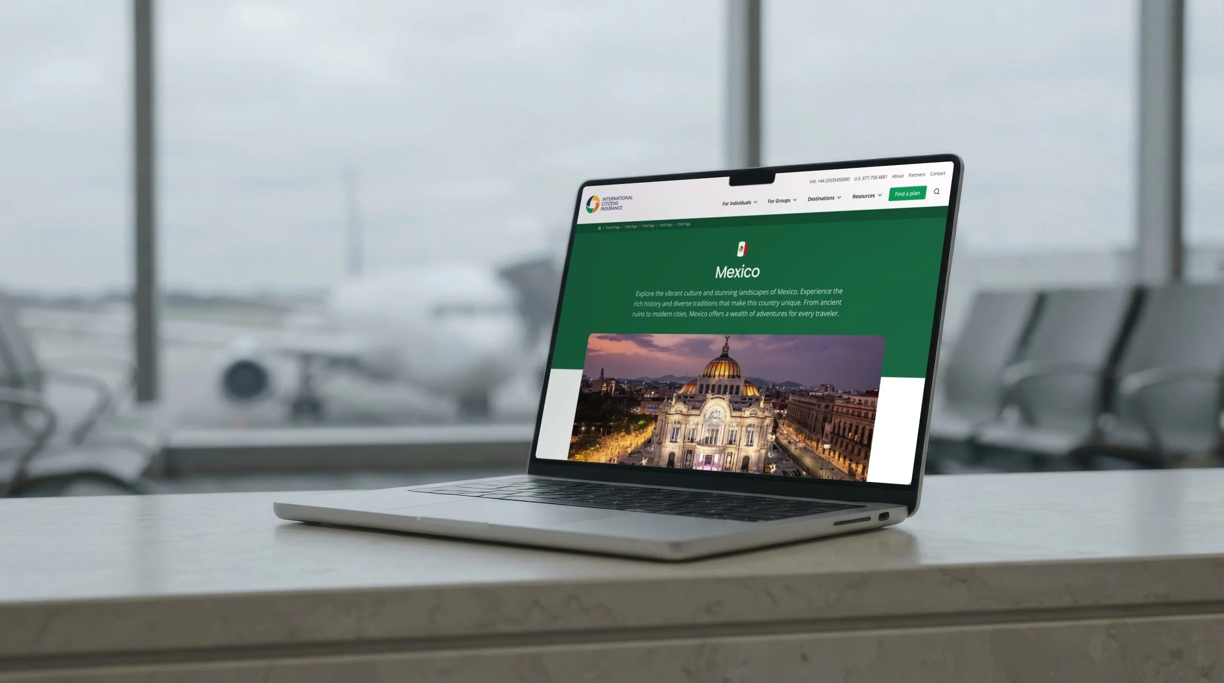
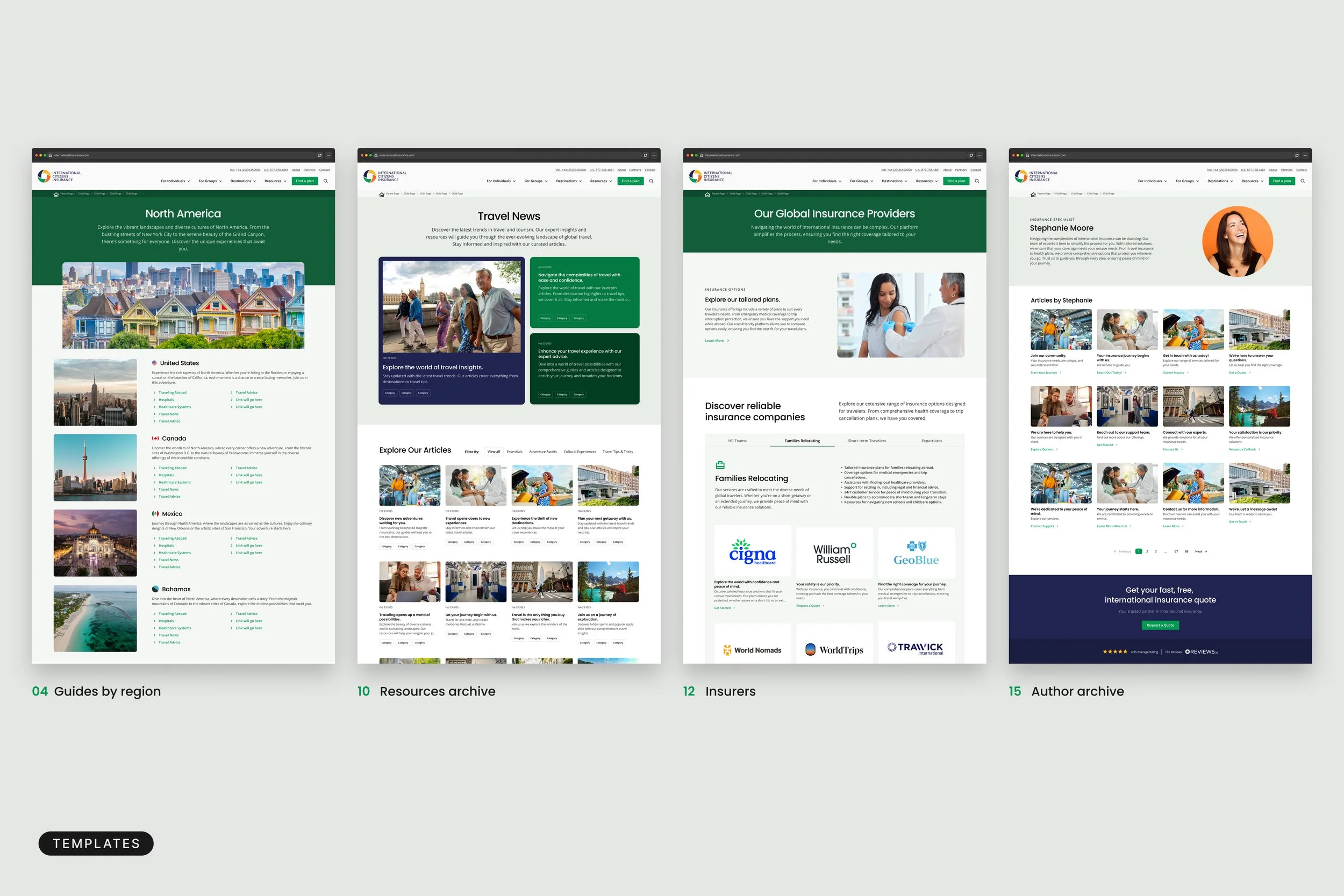
Destinations are organized by region and then country, and each country guide follows one consistent layout, so a visitor learns the pattern once and can read any guide the same way. Resources are treated as archives with their own looks and filters for news, advice and articles, so people can narrow down what they want instead of scrolling through everything.
A design system for dense content
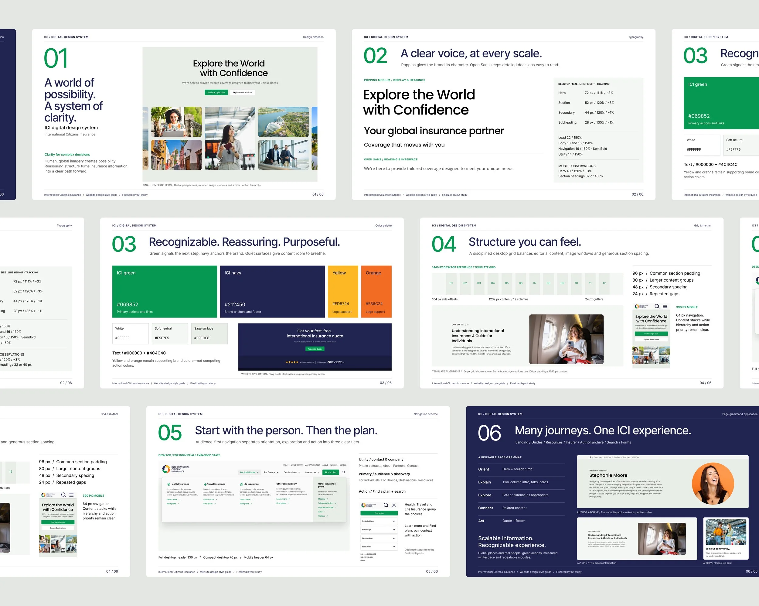
The site's size was the real design problem, so I solved it with a system rather than page by page. A set of page templates covers each type of content, built from shared modules: hero banners, card grids, tabs, comparison tables, accordions, guide cards and calls to action. Each template separates the main content from related links, so the reading experience stays clear and the next step is easy to see. Short-form content and long-form guides get distinct layouts, which tells visitors what kind of read to expect before they begin. Because everything is built from the same pieces, new pages come together quickly and stay consistent as the site grows.
A look that feels inviting
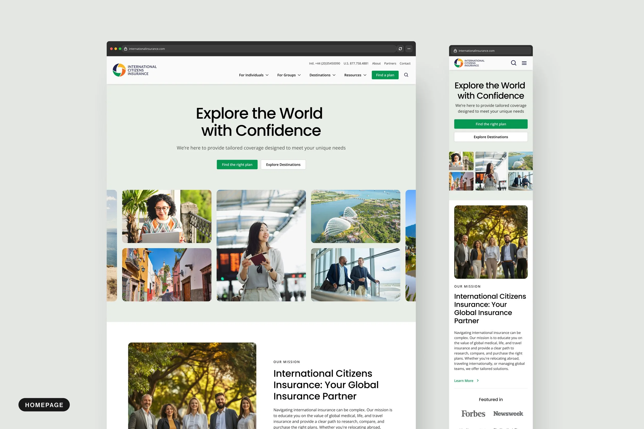
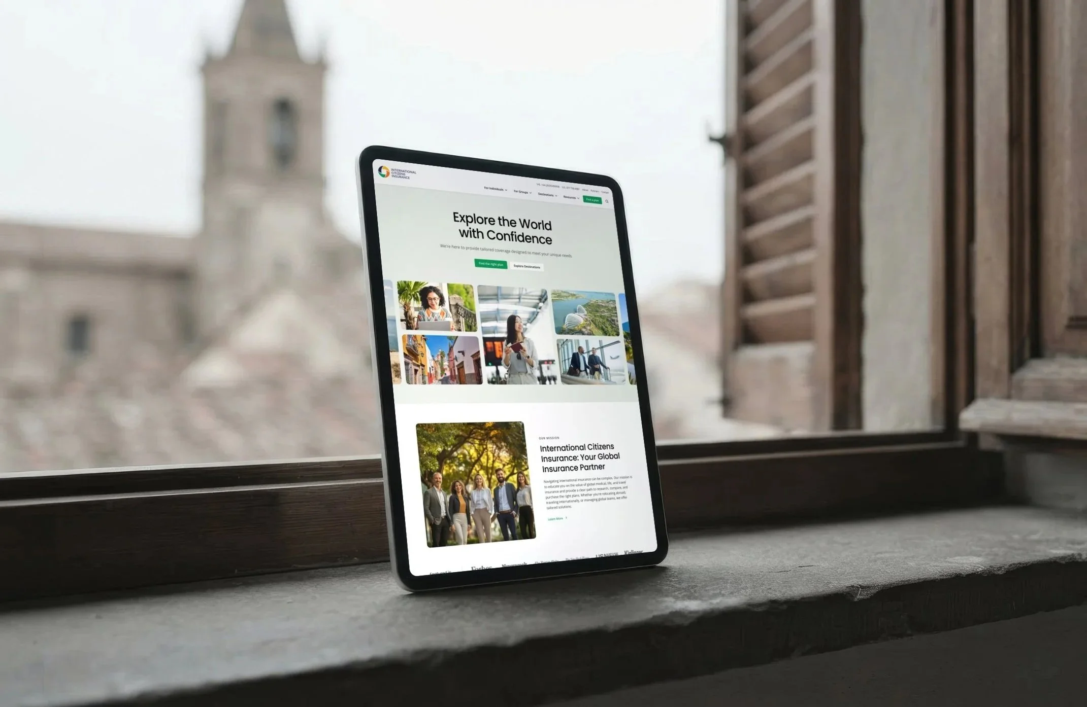
The visual design moves away from walls of text. Generous white space, large type, strong photography of real travelers and a clear green and navy palette with warm accent colors make each page easier to scan and more welcoming. Poppins headlines and Open Sans body text keep the reading experience clean, and a consistent grid holds every layout together. The same system scales down to tablet and phone, with a simplified mobile menu and layouts reworked for small screens, so the site is as easy to use on the road as it is at a desk.